Simplicity, minimal distractions and reassurance are among the essentials for a successful payment page
There’s a lot at play when it comes to converting a user into a subscriber – engagement, enough added value, reassurance, a good UX, customer support… and this shouldn’t be forgotten when it comes to the most important part of the funnel. Payment…
So, how can you build a successful subscription payment page?
- Ease and simplicity
- Reassurance & transparency
- Minimal distractions
- Increase retention
- Make sure the reader converts
- Offer options
Ease and simplicity
- Only ask for the most essential information (why do you need someone’s postal address if their subscribing to a digital-only offer?)
- A single page for all payment info
- Don’t forget about a mobile-friendly version of this page (and all conversion steps for that matter)
- Clicks over typing (i.e. how can you collect this data point without requiring much effort from the reader?)
Consider ‘fold-away’ sections of the page, such as only showing the form for one payment method at a time, just like The Telegraph:
Reassurance & transparency
Building a trusting relationship is vital for high conversion and retention rates, and payment is a touchy step in the user’s journey. The key is to not keep anything hidden – be very clear about what you’ll take from their account, what this payment will give them access to and how often they’ll have to pay.
- If a user’s subscription will renew automatically, make sure to tell them on this page
- If it’s a free trial, explain why you’re collecting payment
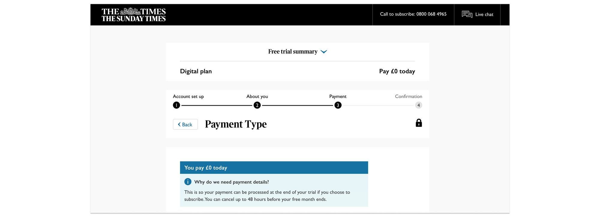
Use bold text and icons to highlight key features that will reassure users:
- Verified secure payment (include certification badges or logos)
- “Cancel anytime” or “No commitment”
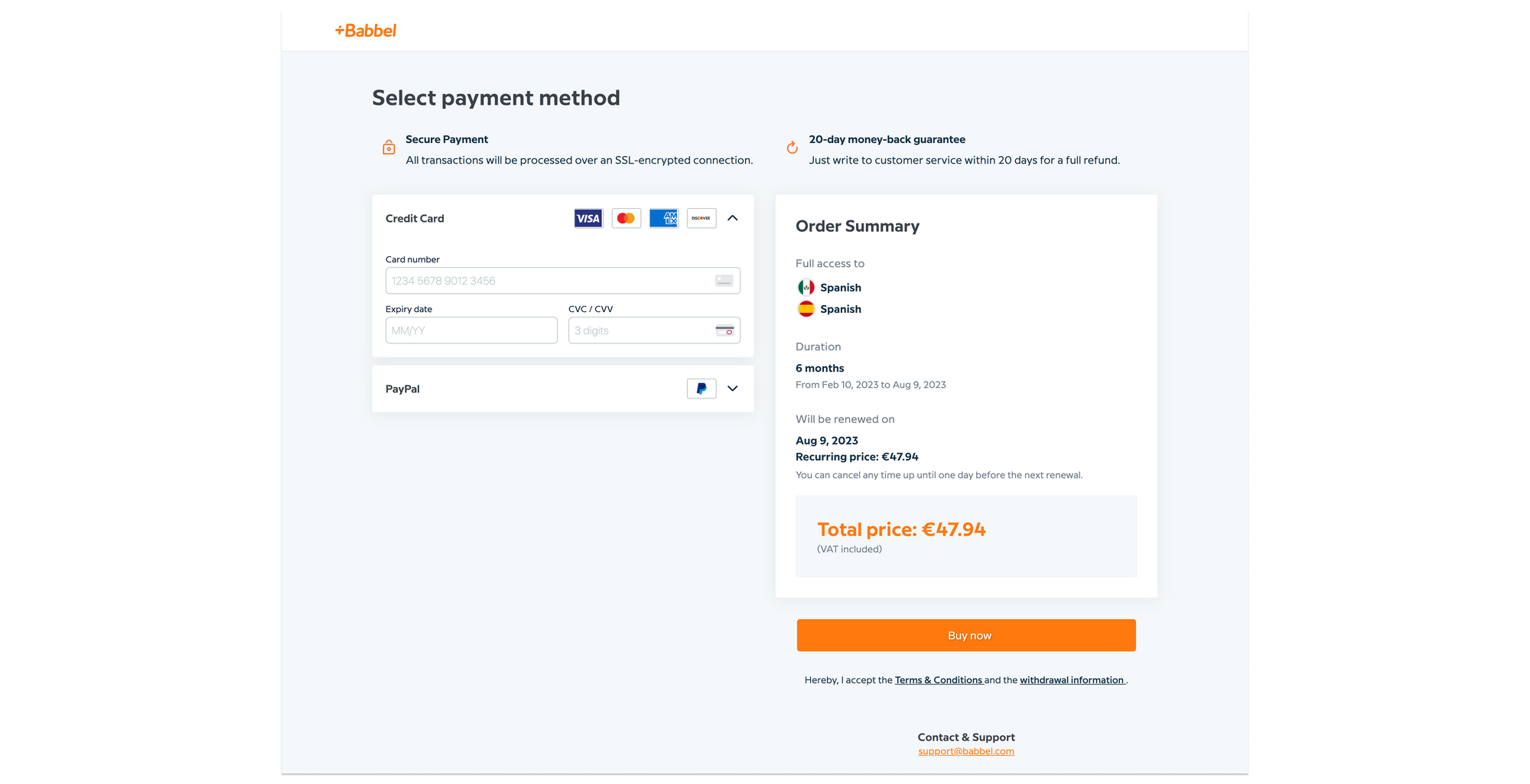
- “Money-back guarantee” (a unique strategy employed by Babbel as an alternative to a free trial, filtering out the bargain hunters whilst reassuring users that they can change their mind within 20 days)
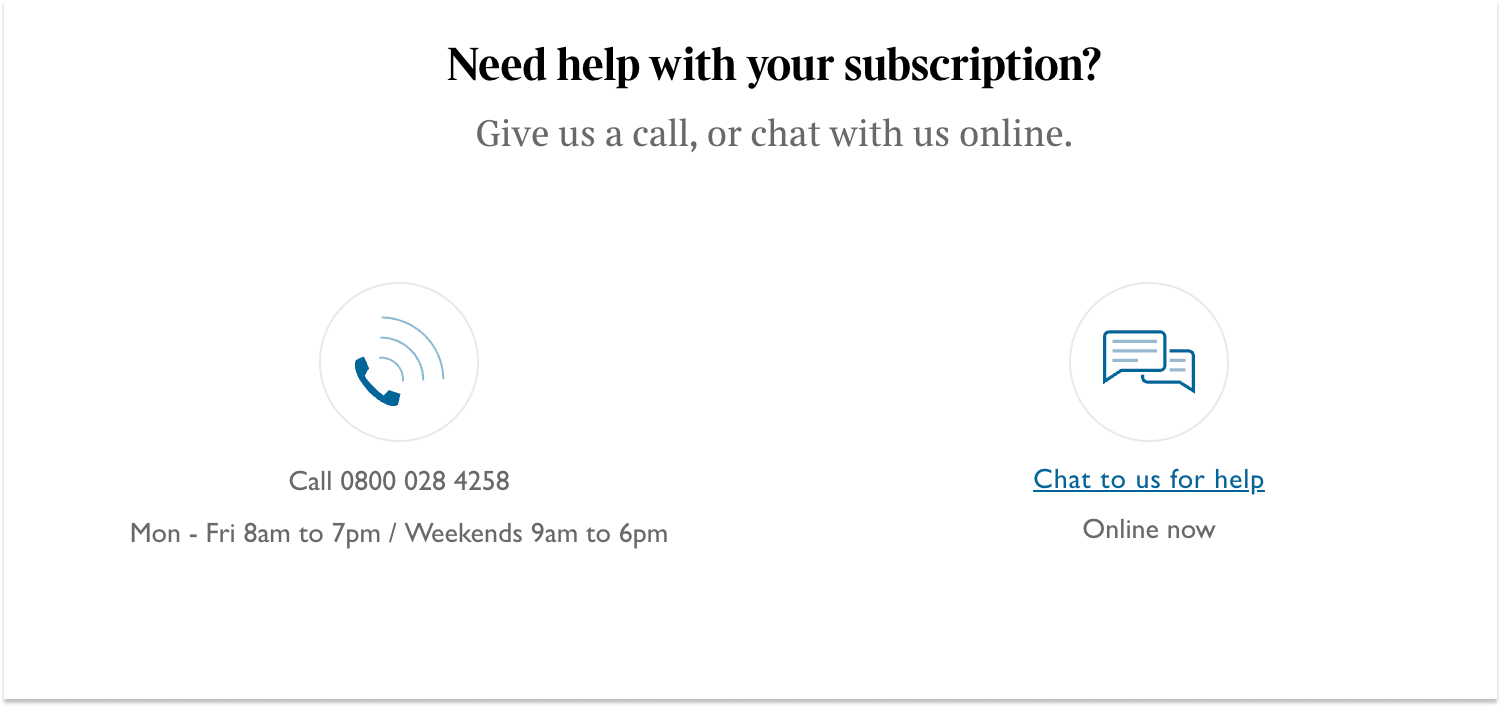
- Links to contact customer support or discuss options on a live chat
Add an ‘Order summary’ for full transparency, including the billing date, amount and recurrence:
Minimal distractions
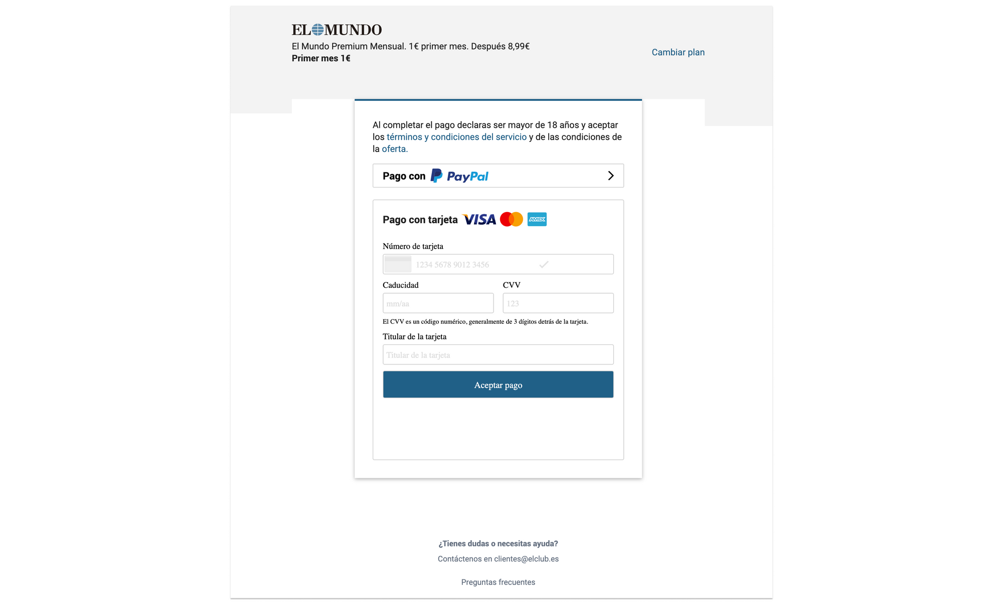
Keep things simple – no advertising, images or unnecessary text on this page, the priority is to provide a smooth, engaging user experience that causes zero friction.
Increase retention
Work on increasing retention rates before the user has even subscribed:
- Test monthly vs annual payment to discover which proves the most valuable for high CLTV and retention, fore-fronting the winning option
- Clear communication and transparency will naturally support retention rates as you start to develop a closer relationship with the user before they’ve even finished subscribing
- Promote recurring payment options rather than relying on the subscriber to transfer the payment
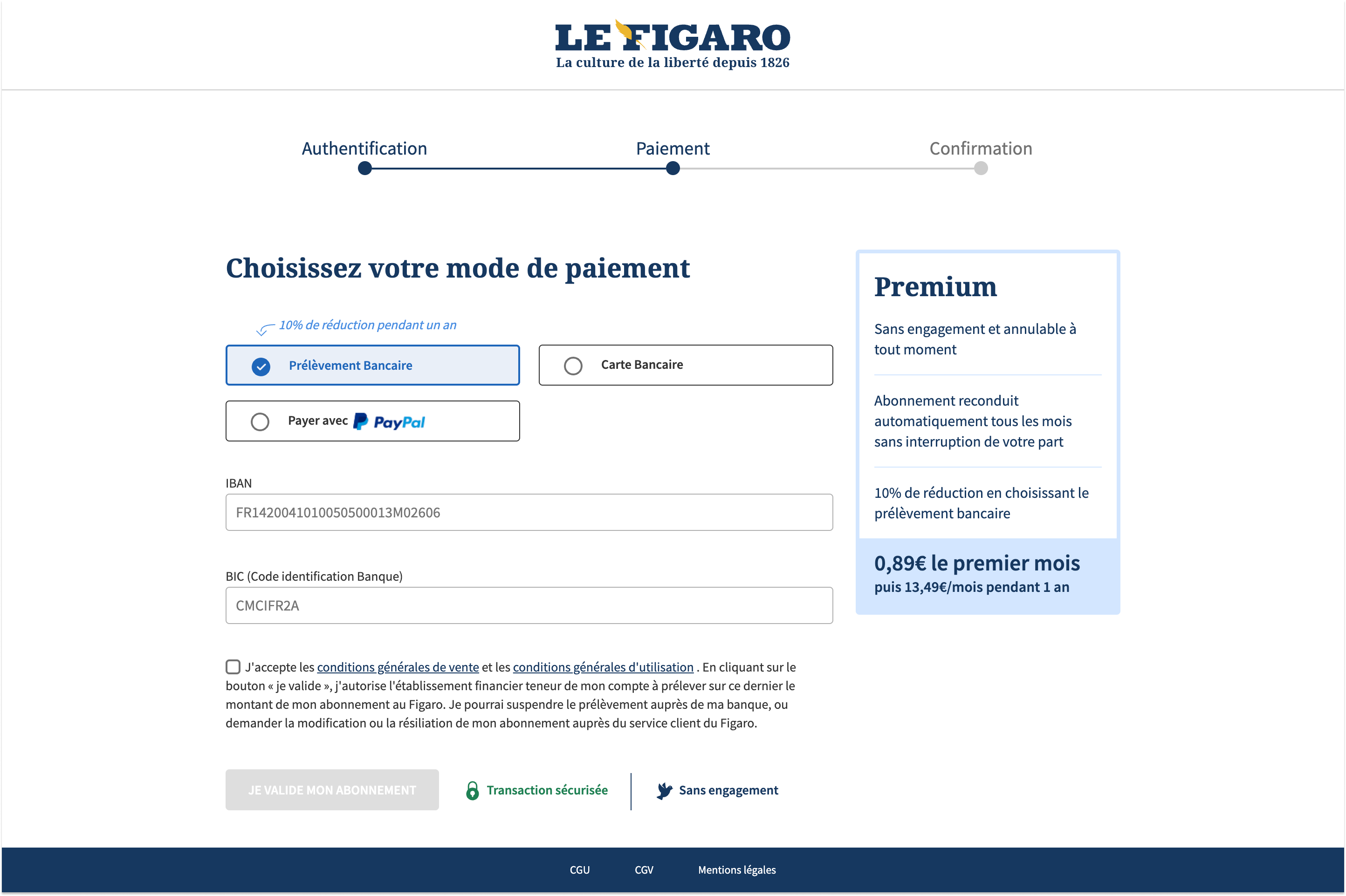
Le Figaro offers a 10% discount to those who subscribe with the automatic payment method:
Make sure the reader converts
The ultimate goal of payment in the conversion funnel is, of course, that a user actually finalizes the process to become a subscriber.
- Integrate a pop up if the user takes too long to check everything’s ok
- Make sure support options are within reach – e.g. with a chat bubble in the corner
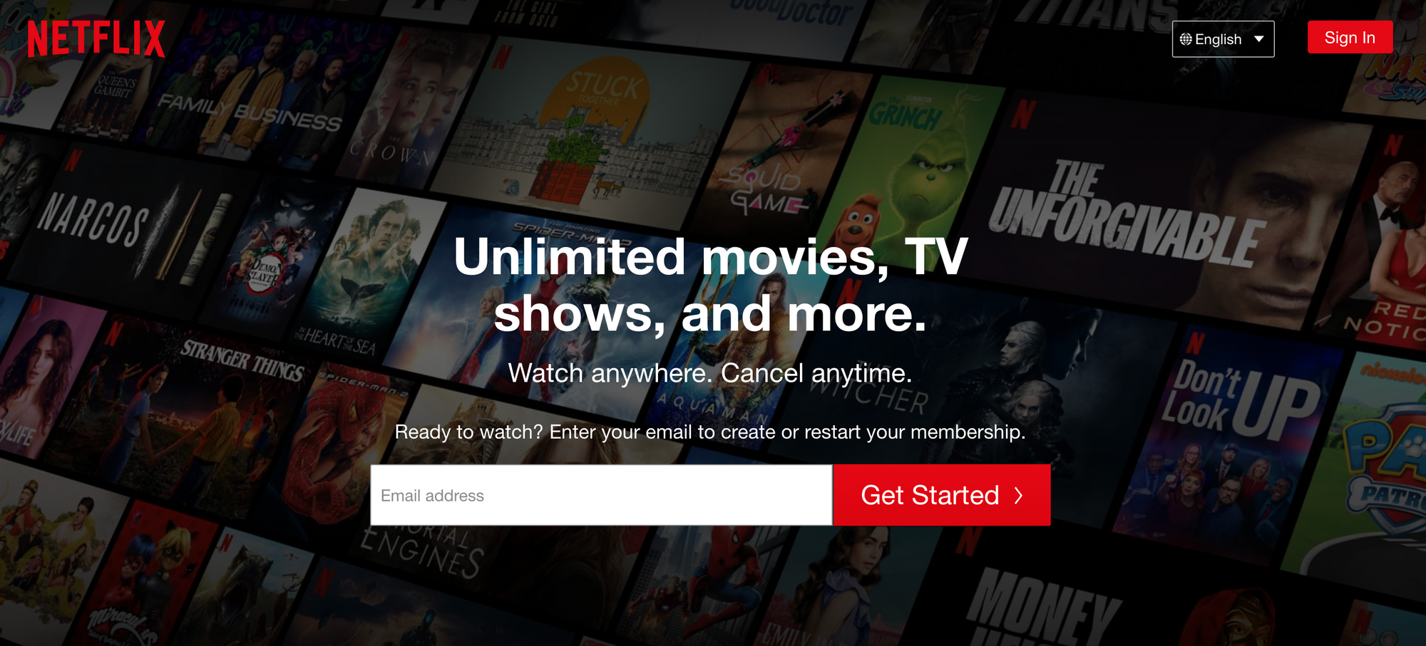
- Consider collecting email address as the first step in the conversion funnel to target an email campaign if the user abandons the process, a technique employed by Netflix
Offer options
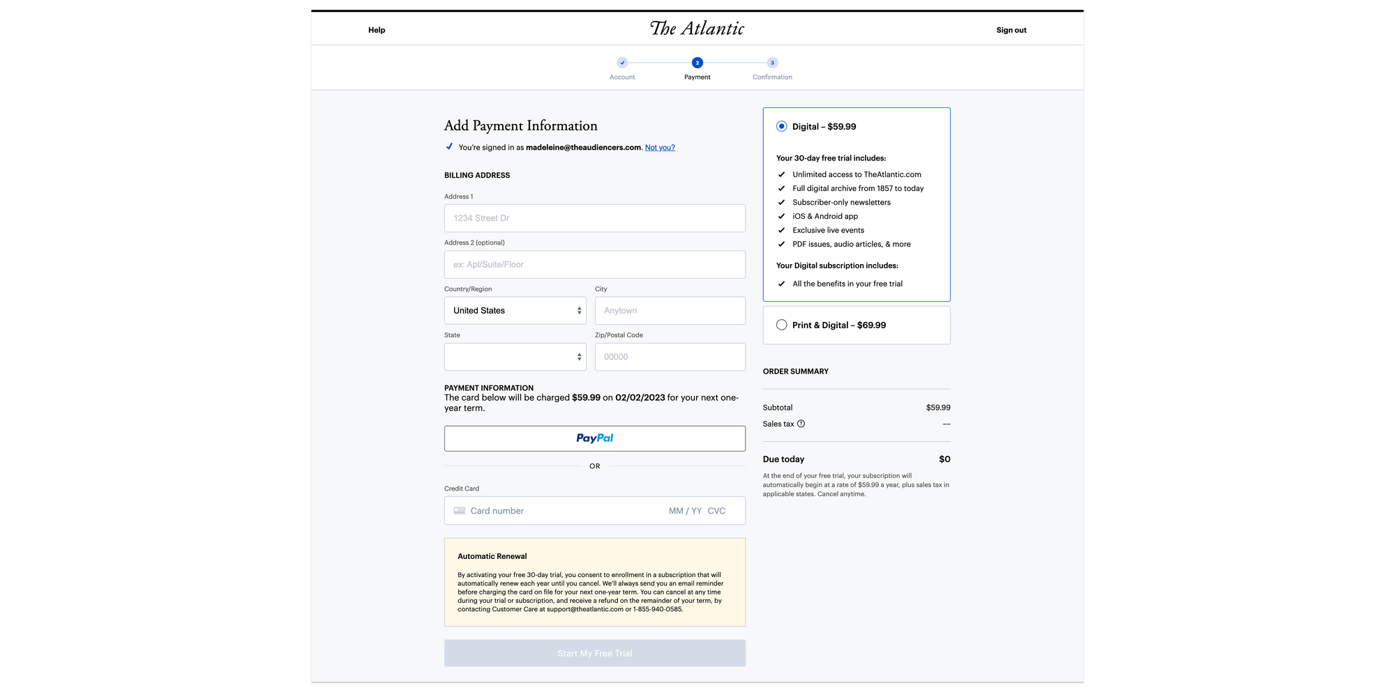
- Multiple and reliable payment methods to choose from
- Monthly or annual payment
- Print + digital vs digital-only
Madeleine White
Content Marketing Manager, Poool
